Shift
Shift.online is a UK marketplace for two-person and last-mile delivery. Its Driver.App runs on Android and iOS, built in Flutter and maintained by the engineering team alone, without design.
Shift had acquired Movinga, which is how I came to it — two driver apps side by side, our PWA and this one.
Built with
- Flutter (Android and iOS)
- Figma
- driver feedback
- component library
The situation
- Driver feedback
- To the Flutter team
- Contrast and legibility
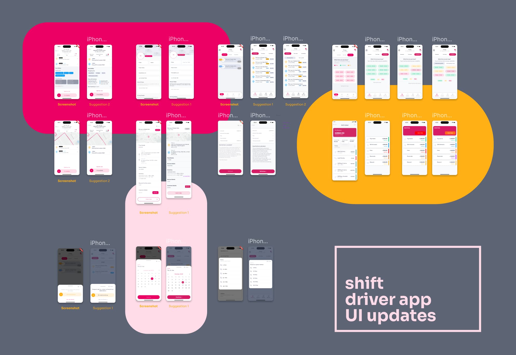
- Screens rebuilt
An app that ships continuously without design consultation works for a while, and then it does not. I aggregated the feedback the drivers were already giving and took it to the Flutter team.
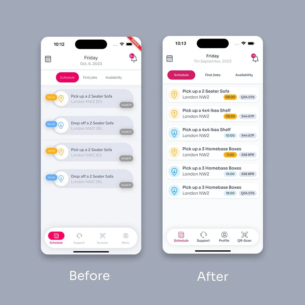
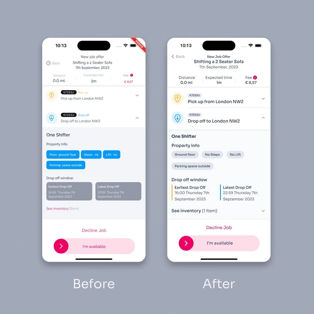
What came back was not a redesign brief. It was contrast, grey tones, legibility and patterns you could tell apart — the things that decide whether a phone is readable in a van.
In numbers
2023 Full Time Employment
What changed
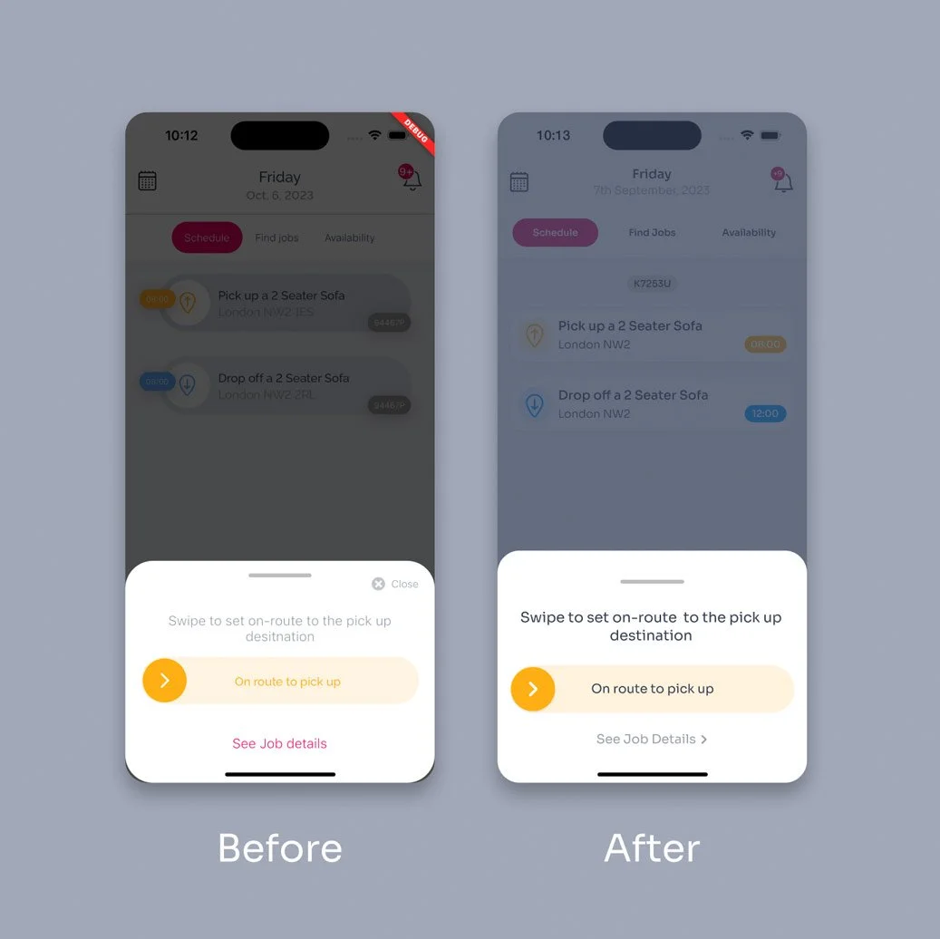
Fewer containers. The pick-up amber and drop-off blue hold across every screen instead of appearing per component. Modals moved onto an overlay in the brand colour, and the type got bolder.
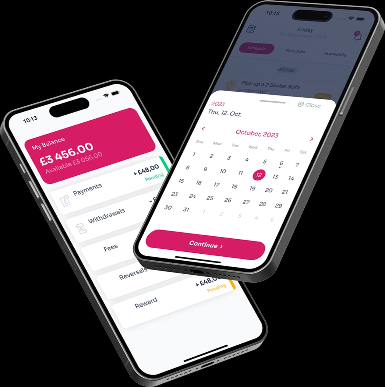
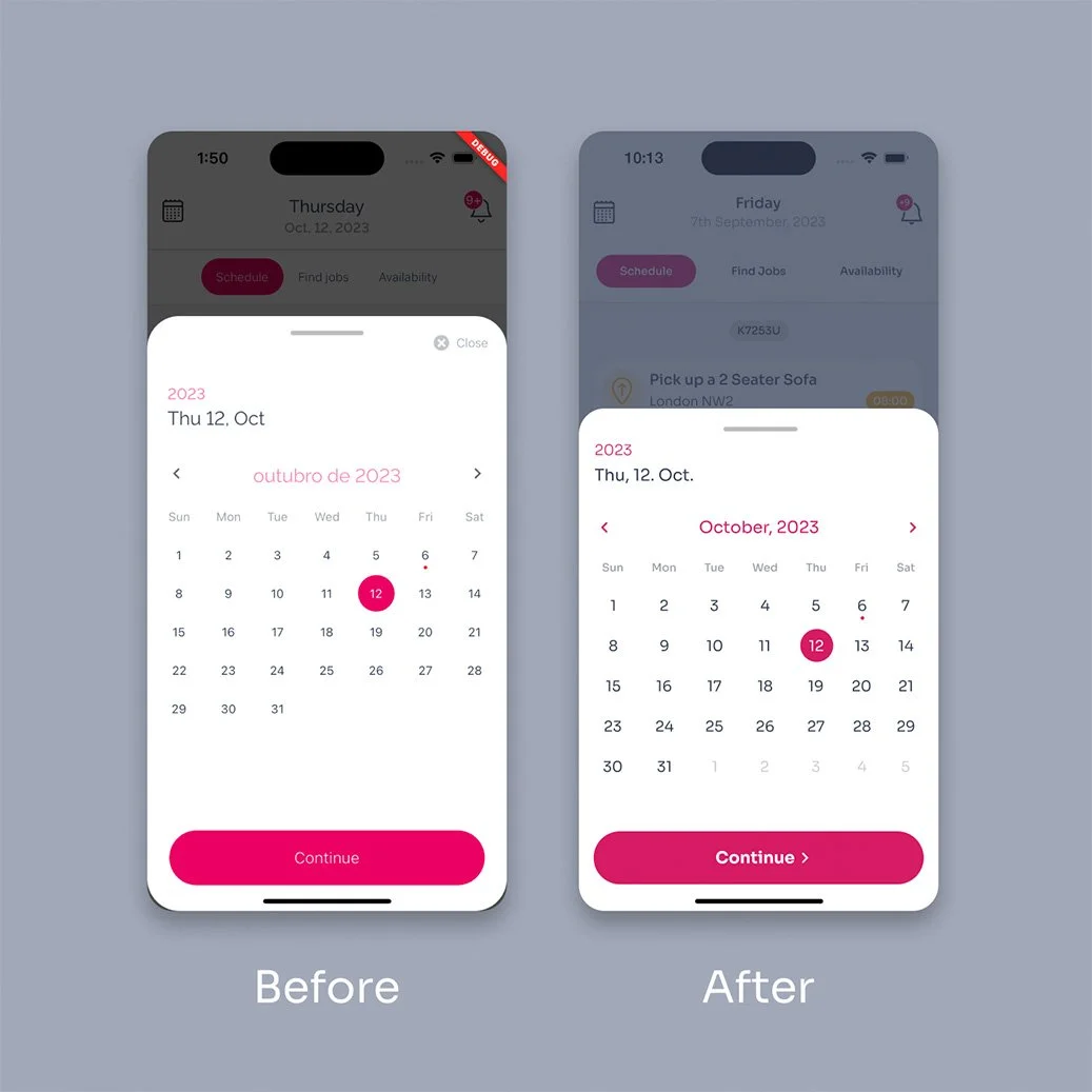
The small things surface the same way. A date picker was showing “outubro de 2023” in an English app, and the swipe prompt said “desitnation”. Nobody files a ticket for that; a driver just squints and carries on.
Result
The drivers noticed, because looking at the phone is most of the job. The engineering team could build cleaner screens in less time, and the component library got tidied on the way.
“Sometimes it’s a bunch of small changes that make the work for us and the users easier.” — Felipe, Flutter engineer
What can Iget out ofyour way?
Reach out