waffle
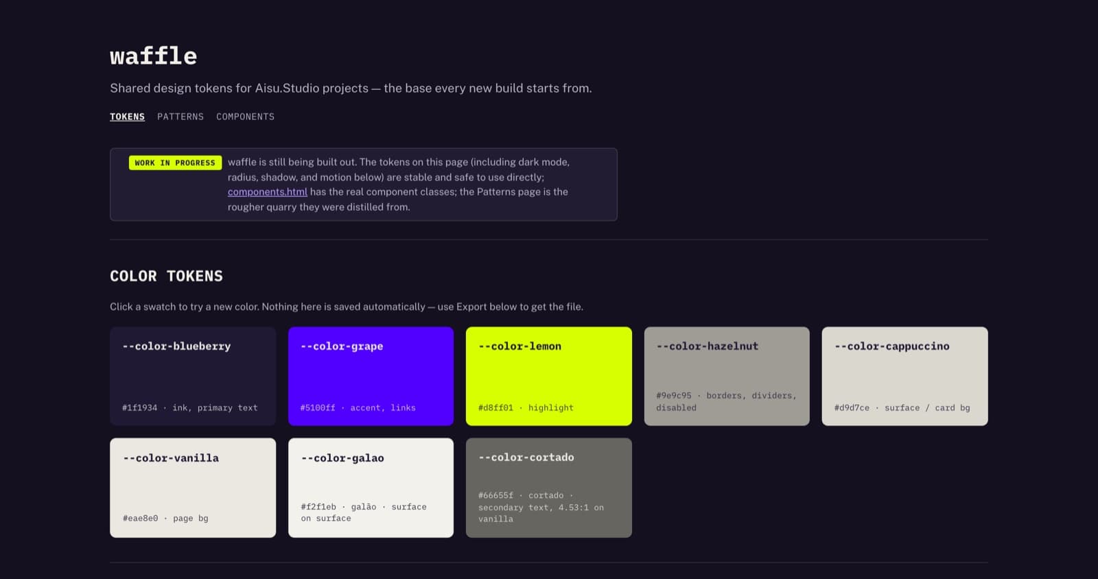
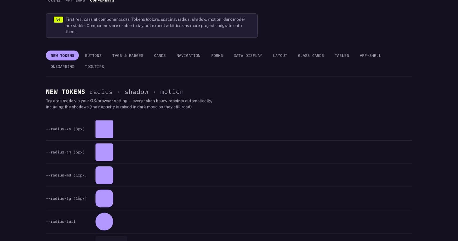
waffle is my shared design system behind most of my agentic projects: colour including dark mode, spacing, radius, shadow, motion and self-hosted fonts.
It is the default base every new build starts from.
Built with
- CSS custom properties
- no framework
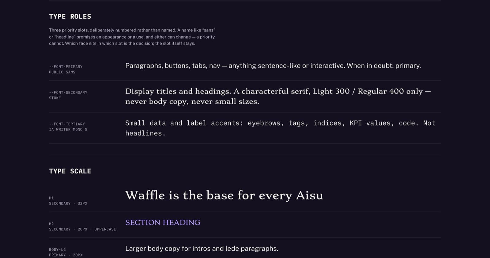
- self-hosted fonts (Public Sans, iA Writer Mono, Stoke)
How it works
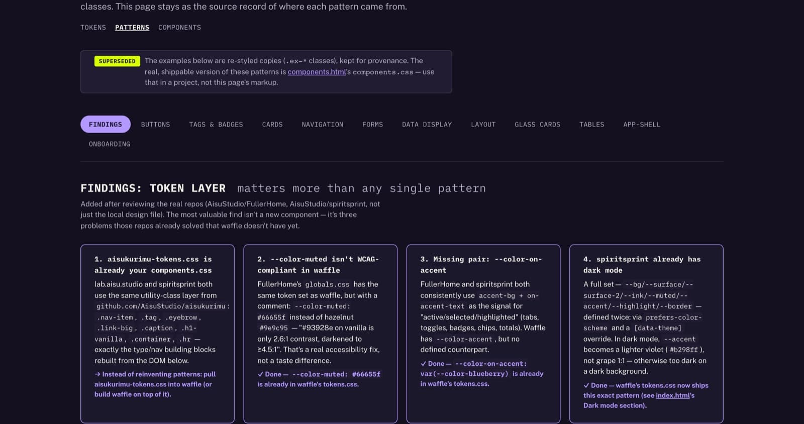
- Quarry of real pages
- Tokens
- Component classes
- Live reference page
New projects link the token and component sheets directly. Existing projects carry their own copies of the same palette. They get refactored one at a time, whenever there is a reason to touch them anyway.
A live reference page renders every token and every component class, one example each, with an export button.
In numbers
2026 8 Days
Three colour tiers
Primary carries brand and interaction, secondary carries surfaces. The third tier is functional: five flavours across five levels of intensity.
Flavours encode meaning in content — sequential scales, heatmaps, priority coding, categorical series. One level read across flavours gives a categorical series; one flavour read from one to five gives a sequential scale. A flavour is never used to style a button or a border.
Provenance
The component sheet was distilled from a quarry of real pages, not designed in the abstract. The quarry is kept in the repo — not for reuse, but so every class can be traced back to the page it was earned on.
What's next
In use across most projects Next: a clean-up, and one library across web and Figma
What can Iget out ofyour way?
Reach out